Friday 7 June 2024

Laura Jones Wins the 2024 Archibald Prize with a Portrait of Tim Winton, Part of a Grand Artistic Tradition

Winner Archibald Prize 2024, Laura Jones, Tim Winton, oil on linen, 198 x 152.5 cm. © the artist, image © Art Gallery of New South Wales, Jenni Carter

By Joanna Mendelssohn, The University of Melbourne

In awarding this year’s Archibald Prize to Laura Jones’ portrait of the writer Tim Winton, the Trustees of the Art Gallery of New South Wales are doing what they do best: catapulting a relatively unknown artist to instant fame and possible fortune.

Her portrait of Winton is a study of a man in emotional pain, as he contemplates the possible futures of the world around him.

One of the great disadvantages of being a writer or an artist is that they can see what politicians do not: the long-term consequences of abusing the environment. Both Winton the subject and Jones the artist see our planet is on a path to environmental doom.

Jones met Winton when she was undertaking a residency to study the bleaching of the Great Barrier Reef, so it is appropriate the tones she has chosen as the background to his portrait are dull and muted like a degraded world.

Most of the painting is thinly painted with the exception of his face. This gives the portrait an extra impact.

Although Laura Jones has been a finalist in four previous Archibald Prize exhibitions and has exhibited widely, her profile indicates the only significant collection to hold her work is Artbank, the collection of the Australian government.

That is all about to change.
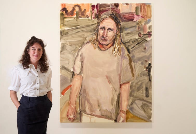
Winner Archibald Prize 2024, Laura Jones with her winning work Tim Winton, oil on linen, 198 x 152.5 cm. © the artist, image © Art Gallery of New South Wales, Diana Panuccio

In what may be a coincidence, another exhibition on the same floor is a solo exhibition by a previous Archibald winner, Wendy Sharpe, whose painterly approach is similar to Jones.

Sharpe’s work not only relates to Jones’ painting in style, but also the circumstance of her winning the prize. In 1996, Sharpe was a relatively unknown artist when she too was awarded the Archibald Prize. The prize was the trigger for a career that has included a stint of being a Gallery Trustee.

The Archibald really does sprinkle fairy dust.

Djakaŋu Yunupiŋu wins the Wynne Prize

When the board president of the trustees, David Gonski, announced the Wynne Prize he took great joy in noting this year the majority of the entrants selected for hanging were Aboriginal artists.

Awarded to “the best landscape painting of Australian scenery in oils or watercolours or for the best example of figure sculpture by Australian artists”, this oldest of all Australian art prizes has come a long way from when it was dominated by paintings of gum trees in pastoral landscapes.

Djakaŋu Yunupiŋu’s painting, Nyalala gurmilili, is a celebration of sunrise in Miḏawarr (the harvest season following the wet) when sudden showers surprise during the day.
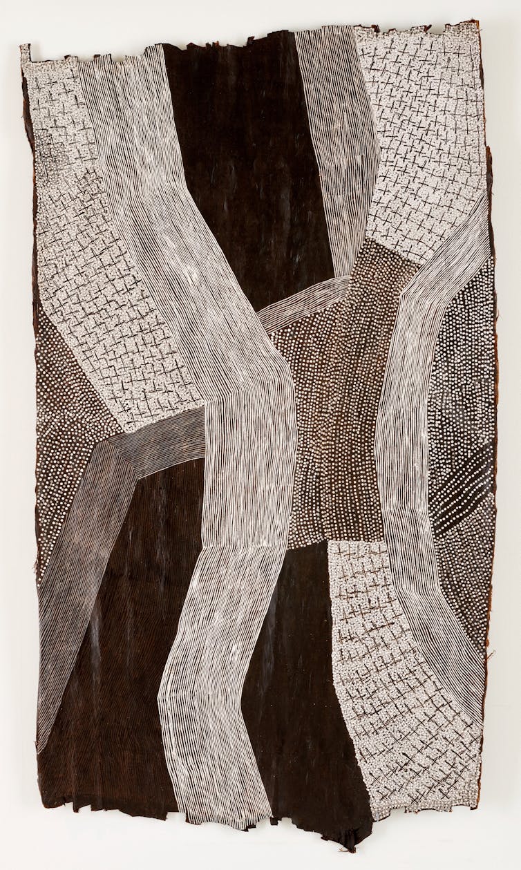
A black and white bark painting.
Winner Wynne Prize 2024, Djakaŋu Yunupiŋu, Nyalala gurmilili, natural pigments on bark, 263 x 154 cm. © the artist, image © Art Gallery of New South Wales, Jenni Carter

It is probably the largest bark painting to be exhibited in the gallery, a glorious undulating pattern of rhythms and shapes.

There is a special significance in this artist being awarded the prize for this work at this gallery.

Many years ago her father, Muŋgurrawuy Yunupiŋu, was one of a group of Yolngu elders who sat with the gallery’s assistant director, Tony Tuckson, and showed him the connection between painting and lore. Muŋgurrawuy Yunupiŋu’s bark paintings are among the treasures of the Art Gallery of NSW’s collection.

Naomi Kantjuriny wins the Sulman Prize

Unlike the Archibald and Wynne Prizes, which are judged by the trustees, the Sulman Prize for best subject painting, genre painting or mural project has a single judge, usually an artist.

This means every year the exhibition has a different flavour, reflecting the judge’s taste. This year’s judge, Tom Polo, selected an exhibition ranging from the traditional formalism of David Eastwood to the conceptual humour of Kenny Pittock.

He has awarded the prize to Naomi Kantjuriny for her painting Minyma mamu tjuta, from the Tjala Arts Centre. She has described her painting as being about the stories told and her culture.

It is a lively painting of spirits, good and bad, dancing in the land, gathering around people, always present.

The Archibald, Wynne and Sulman Prizes 2024 are on display at the Art Gallery of New South Wales, Sydney, until September 8.The Conversation

Joanna Mendelssohn, Honorary (Senior Fellow) School of Culture and Communication University of Melbourne. Editor in Chief, Design and Art of Australia Online, The University of Melbourne

This article is republished from The Conversation under a Creative Commons license. 

Subscribe to support our independent and original journalism, photography, artwork and film.

Monday 3 June 2024

Archibald Prize 2024: This Year’s Finalists Range from Downright Fun to Politically Ferocious

Archibald Prize 2024 finalist, Shaun Gladwell ‘A spangled symbolist portrait of Julian Assange floating in reflection’, oil and aluminum flakes on canvas, 151.5 x 112 cm © the artist, image © Art Gallery of New South Wales, Jenni Carter. Cover picture by Andrea Heinsohn in Paris. 


By Joanna Mendelssohn, The University of Melbourne

Wayne Tunnicliffe, head of Australian art at the Art Gallery of NSW, has a sense of humour. The main entrance to this year’s Archibald, Wynne and Sulman Prize exhibition features a giant black and white photograph of a student demonstration from 1953. At the time the gallery trustees, who are named in Archibald’s will as the judges of the prize, were actively hostile to any idea of modern art. Their taste was so predicable that the gallery’s director, Hal Missingham, would write the telegram congratulating the winner before the voting.

By the 1970s, when I was working at the gallery, trustees were less likely to vote for their mates. But there was a deep cultural disconnect between the aesthetic taste of the gallery’s professional curators, the arts community and the media, who lived in hope of a controversy such as the 1944 William Dobell court case.

The task of turning the trustees’ choice into an interesting exhibition was best described as “a challenge”.

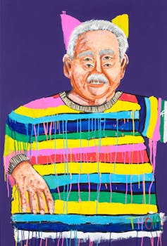
Archibald Prize 2024 finalist, Thom Roberts ‘Big Bamm-Bamm’, synthetic polymer paint on canvas, 152.5 x 102.5 cm © the artist, image © Art Gallery of New South Wales, Jenni Carter.

In recent years, the gallery’s board has learned to have more faith in the two artist trustees, and winners have tended to reflect their interests. It is therefore appropriate to thank both Tony Albert and Caroline Rothwell, who also judged last year’s prize, for this year’s very lively exhibition. The awarding of the prize to Julia Gutman’s embroidered and painted collage last year appears to have unleashed an especially lively range of entries this year.

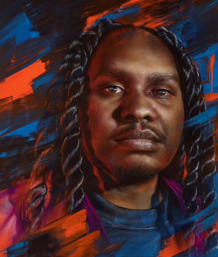
In addition, the Packing Room prize is now judged by a trio of the gallery’s expert installation crew, all of whom know more about art than just what they like. This year’s prize winner, Matt Adnate, began as a street artist spraying graffiti. He is now better known for his murals, including some of the popular Yolngu rapper Baker Boy – the subject of his winning painting.

Winner Packing Room Prize 2024, Matt Adnate ‘Rhythms of heritage’, spray paint and synthetic polymer paint on linen, 220 x 188.5 cm © the artist, image © Art Gallery of New South Wales, Jenni Carter.

The biggest change is that the exhibition has been hung by the Head of Australian Art, an indication the gallery now takes the Archibald very seriously indeed. Only a very brave person would predict this year’s winner of the Archibald Prize.

Whether or not they are likely to win, there are quite a few works that deserve a closer look. Some because they are wittily original, others because of the political message they carry, or because their subject is especially newsworthy. Then there are paintings that simply bring joy.

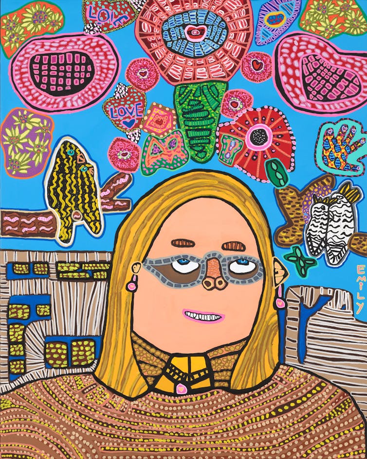
There is a special pleasure in looking at Emily Crockford’s Singing with my selfie at the top of the world with my imagination, remembering her previous exhibits and seeing how her art has developed. That is also true of Digby Webster, another returned exhibitor who has painted his filmmaker, Trevor. Meagan Pelham, who like Crockford works through Studio A, has called her portrait of the National Portrait Gallery’s curator, Isobel Parker Philip, Highlight in the moonlight.

Archibald Prize 2024 finalist, Emily Crockford ‘Singing with my selfie at the top of the world with my imagination’, synthetic polymer paint on canvas, 150 x 120 cm © the artist, image © Art Gallery of New South Wales, Jenni Carter.

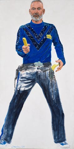
Drew Bickford’s gloriously lurid Direct-to-Video portrait of filmmaking duo Soda Jerk is at first a puzzle as the two sisters have been melded into one, but he has captured both their ambiguity and their glorious sense of anarchy as they happily make “directors’ cuts” of iconic cinema.

Archibald Prize 2024 finalist, Drew Bickford ‘Direct-to-video’, oil on canvas, 152 x 101.7 cm © the artist, image © Art Gallery of New South Wales, Jenni Carter.

Camellia Morris’s Wild Wild Wiggle is just fun, while Thom Roberts’ Big Bamm-Bamm is a reminder of a time when anything relating to Ken Done (the sitter) would automatically be rejected.

Archibald Prize 2024 finalist, Camellia Morris ‘Wild Wild Wiggle’, synthetic polymer paint on canvas, 183 x 91.5 cm © the artist, image © Art Gallery of New South Wales, Jenni Carter.

Several entries in this year’s prize, while not being of politicians, can be described as political, as their subjects are the change-makers who prick our conscience. Chief among these is Shaun Gladwell’s A spangled symbolist portrait of Julian Assange floating in reflection (pictured at the top of this article). Assange’s eyes look out from a balloon of his head, gagged by a US flag. An image of the Queen is stamped on one cheek, based on the banknote Gladwell used to sketch Assange during his time in Belmarsh Prison, while below his head is suspended in profile.

It hangs next to Anna Mould’s Complicit, ostensibly a portrait of Joan Ross, but as with Ross’s own work, this is a critique of colonisation. More conventional portraits of newsmakers include Sam Leach’s sensitive portrait of Louise Milligan and Kirsty Nielson’s angst-ridden portrait of Cheng Lei.

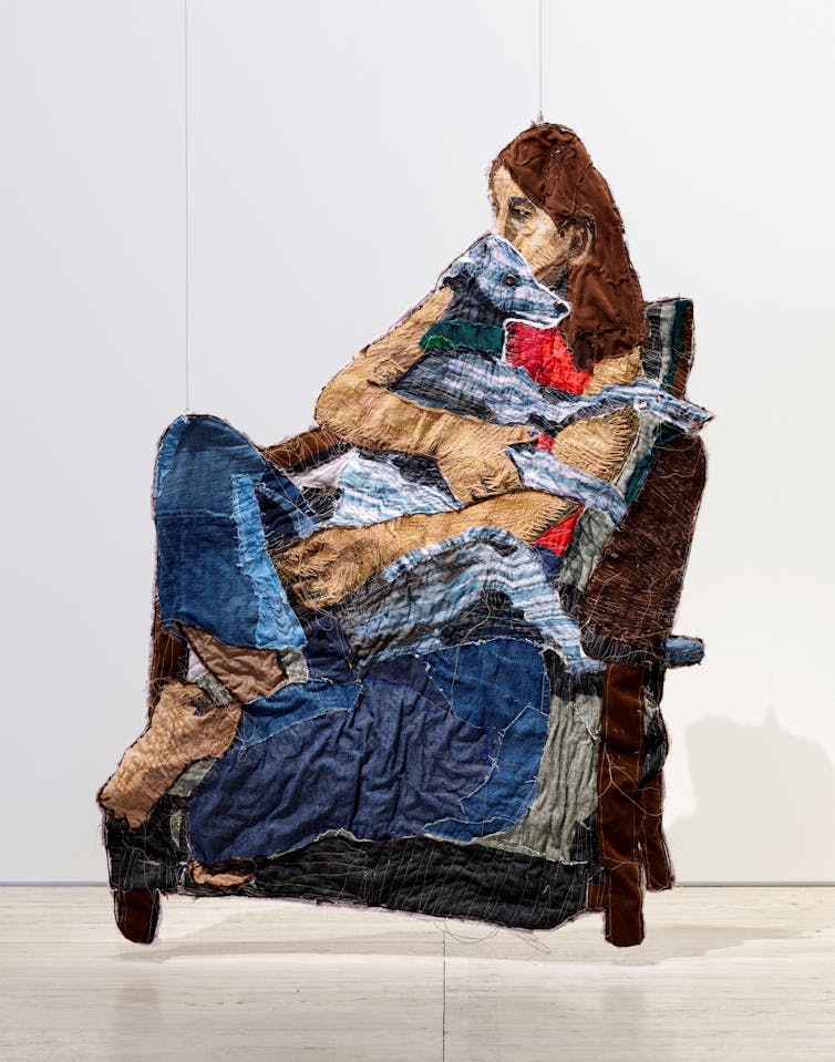
Julia Gutman did not exhibit in this year’s Archibald. Instead she has entered the Wynne with Olive, a suspended sculpture of textiles and wire, showing Olive the dog comforting a grieving friend.

Wynne Prize 2024 finalist, Julia Gutman ‘Olive’, found textiles and wire, 151 x 101 x 1.5 cm © the artist, image © Art Gallery of New South Wales, Jenni Carter.

Also in the Wynne Prize, the creative duo of Clair Healy and Sean Cordero use flashing lights on their Grey Nomadic Visions. The traditional divisions between different forms of media continue to be dissolved, with Billy Bain’s The fighters incorporating a flag, sewn by his mother.

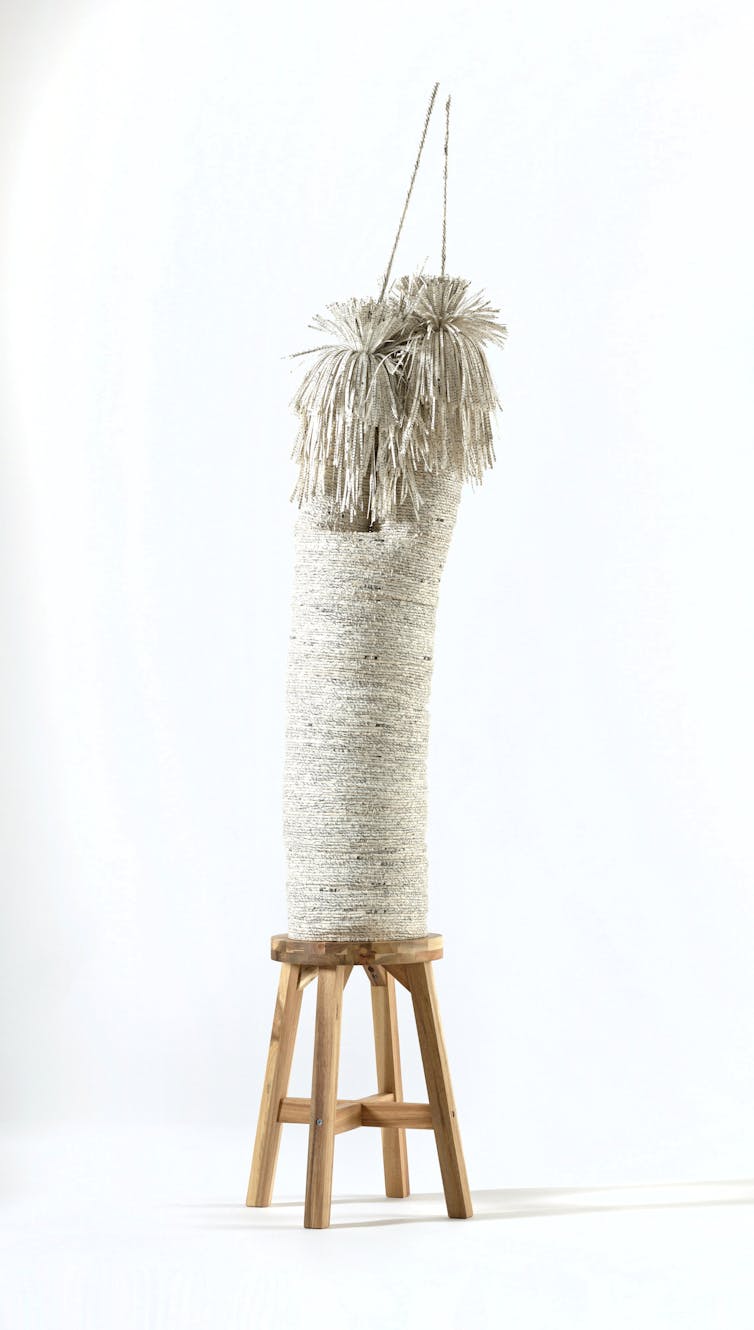
Juanita McLauchlan’s mudhay burrugarrbuu- bula / Possum Magpie also dissolves the barriers between printing, embroidery and collage to evoke a sense of place. More conventionally, Jenna Mayilema Lee has woven a xanthorrhoea in Grass tree (at rest). But the weaving includes pages from an old dictionary of Aboriginal words.

Wynne Prize 2024 finalist, Jenna Mayilema Lee ‘Grass tree (at rest)’, pages from ‘Aboriginal words and place names’ by AJ Reed (1977), organic cotton thread, bamboo, rice starch glue, book cover board, acacia stool, 185 x 38 x 38 cm (variable) © the artist, image © Art Gallery of New South Wales, Jenni Carter.

The dominance of Indigenous artists in this year’s Wynne Prize is a reminder of how John Olsen, who as an art student vocally objected to the trustees’ conservatism, later became a trustee. In his extreme old age he complained to various news media outlets that Aboriginal artists were not painting landscapes. He was, of course, wrong. The Conversation

Joanna Mendelssohn, Honorary (Senior Fellow) School of Culture and Communication University of Melbourne. Editor in Chief, Design and Art of Australia Online, The University of Melbourne

Subscribe to support our independent and original journalism, photography, artwork and film.

Monday 27 May 2024

Scarlett Johansson’s Row with OpenAI Reminds Us Identity is a Slippery Yet Important Subject. AI leaves Everyone’s at Risk

Vianney Le Caer/AP


By Elizabeth Englezos, Griffith University

OpenAI will be removing access to one of its ChatGPT voices, following objections by actor Scarlett Johansson that it sounds “eerily similar” to her own.

Earlier this week, the company said it was “working to pause” the voice of Sky, which is one of a few options users can choose when conversing with the app.

Johannson said OpenAI’s CEO, Sam Altman, had approached her in September and again in May, asking if she would allow her voice to be used in the system.

She declined, only to hear a voice assistant that sounded uncannily like her only days after the second request. She was, in her own words, “shocked, angered and in disbelief”. OpenAI replied by saying:

AI voices should not deliberately mimic a celebrity’s distinctive voice – Sky’s voice is not an imitation of Scarlett Johansson but belongs to a different professional actress using her own natural speaking voice.

Johansson is known to have voiced an AI in the past, for a role in the fictional 2013 film Her – which Altman has declared himself a fan of. He also recently tweeted the word “her” without much further explanation.

Johansson said she had to hire legal counsel to demand the removal of Sky’s voice and information on how the company created it.

This dispute provides a prescient warning of the future identity harms enabled by AI – harms that could reach any of us at any time.

Identity is a slippery subject

Artificial intelligence is developing at an incredible pace, with OpenAI’s ChatGPT being a game-changer. It’s very likely AI assistants will soon be able to meaningfully converse with users, and even form all sorts of “relationships” with them. This may be why Johansson is concerned.

One thing has become unassailably clear: we can’t out-legislate AI. Instead, we need a right to identity, and with that a right to request the removal, deletion (or otherwise) of content that causes identity harm.

But what exactly is “identity”? It’s a complex idea. Our identity may say nothing about our specific personal traits or qualities, yet it is fundamental to who we are: something we build through a lifetime’s worth of choices.

But it’s also about more than how we see ourselves, as celebrities demonstrate. It’s linked to our image. It is collaborative – cultivated and shaped by how others see us. And in this way it can be tied to our personal traits, such as our voice, facial features, or the way we dress.

Minor attacks against our identity may have limited impacts, but they can add up like death by a thousand cuts.

Legal defences

As AI democratises access to technologies that can manipulate images, audio and video, our identities are becoming increasingly vulnerable to harms not captured by legal protections.

In Australia, school students are already using generative AI to create sexually explicit deepfakes to bully other students.

But unlike deepfakes, most identity harms won’t breach criminal law or draw the ire of the eSafety Commissioner. Most legal avenues afford ill-fitted and piecemeal remedies that can’t heal the damage done. And in many Western democracies, these remedies require legal action that’s more expensive than most can afford.

AI can be used to manipulate or create content that shows “you” doing things you haven’t (or would never do). It could make you appear less competent, or otherwise undermine your reputation.

It could, for example, make you appear drunk in a professional setting, as with former US House Speaker Nancy Pelosi. It could show “you” vaping, when doing so would disqualify you from your sports team, or place you inside a pornographic deepfake video.

Australian law lags behind

The United States Congress recently proposed an actionable right to privacy. But even without this, US protections exceed those offered in Australia.

In the US, privacy is defended through a combination of legal claims, including the publication of private facts, presenting a subject in a false light, or the misappropriation of likeness (as in, co-opting some part of another’s identity and using it for your own purposes).

Based on the limited facts available, US case law suggests Johansson could succeed in action for misappropriation of likeness.

One pivotal case from 1988 featured American singer Bette Midler and the Ford Motor Company. Ford wanted to feature the singer’s voice in an ad campaign. When Midler declined, Ford hired a “sound alike” to sing one of Midler’s most famous songs in a way that sounded “as much as possible” like her.

Midler won, with one court likening Ford’s conduct to that of “the average thief” who simply takes what they can’t buy.

Australian public figures have no equivalent action. In Australia and the UK, the law will intervene where one party seeks to profit by passing off lesser quality look-alikes or sound-alikes as “the real thing”. But this applies only if consumers are misled or if the original suffers a loss.

Misrepresentation might also apply, but only where consumers believe a connection or endorsement exists.

Australia needs a rights-based approach akin to that in the European Union, which has a very specific goal: dignity.

Identity or “personality” rights empower those affected and impose an obligation on those publishing digital content. Subjects may receive damages or may seek injunctions to limit the display or distribution of material that undermines their dignity, privacy or self-determination.

Johansson herself has successfully sued a writer in France on the basis of these protections (although this win was ultimately more symbolic than lucrative).

With AI, it’s now child’s play to impersonate another’s identity. Identity rights are immensely important. Even where these rights co-exist with free speech protections, their very presence enables people to protect their image, name and privacy.The Conversation

Elizabeth Englezos, Lecturer, Griffith Law School, Griffith University

Subscribe to support our independent and original journalism, photography, artwork and film.

Monday 20 May 2024

The King’s First Portrait ~ Understanding the Image Charles Wants to Project for His Reign

PA Images/Alamy


By Gabriele Neher, University of Nottingham

It looks as if many people are “seeing red” when it comes to the first official portrait of King Charles III. Reactions to Jonathan Yeo’s monumental portrait have certainly been mixed.

Fundamentally, this is the most traditional of images. It’s a portrait painted in oil on a monumental scale (it measures nearly seven feet by nine feet) of the the monarch.

Charles wears the red coat of the Welsh Guards, the regiment for which he was made regimental colonel in 1975. A lot of attention has been lavished on his uniform, displaying a range of medals including the striking chain of the Order of the Garter. The colour palette of the painting plays with the rich red hues of that coat.

There are no royal insignia, because this is not the image of a king, this is the image of the patron of The Most Worshipful Company of Drapers, a guild with medieval origins. The portrait was commissioned to mark Charles’s associated with the guild for over 50 years.

Charles’s portrait will join that of his mother, the late Queen Elizabeth II, by the Russian painter Sergei Pavlenko in Draper’s Hall. She had been a Draper since 1947 and the Company commissioned her image on the occasion of the diamond jubilee.

As the first painted image of the king to be revealed since his coronation a year ago, this is the first time that we get a glimpse of the emerging fashioning of the image of King Charles III and, as such, it puts down a marker for how the king wishes to create his own visual legacy.

It’s worth putting this into the context of “self-fashioning” in portraiture, succinctly described by the literary scholar Stephen Greenblatt in 1980 as a process where identity is constructed as a pastiche of carefully selected details. In other words, you don’t get to see the “real” image of a person, what you get to see is an ideal projection of a carefully curated identity, highlighting the aspects they want you to see.

The late queen’s image depicts her in her official uniform for portraiture, the ubiquitous long white gown, worn with a blue sash and the striking blue velvet cloak of the Order of the Garter. Elizabeth’s image is familiar and safe and speaks of constancy and long service.

Like her image, the king’s image keeps firmly within tradition. It does so by following the long-established convention of showing male monarchs in uniform – in this case, in the striking red coat of the Welsh Guards – leaning on the hilt of a ceremonial sword held in front of him.

What is less traditional is the inclusion of a butterfly fluttering above the King’s right shoulder. This butterfly and the king’s face and hands are the only parts of the image that aren’t in shades of reds, oranges and pinks. According to Yeo, the inclusion of that butterfly was Charles’s suggestion, placed on his shoulder as an “attribute” and conversation starter.

There is a long history in portraiture with regards to placing objects as key interpretative markers for the sitter’s personality. A book becomes a symbol of learnedness and wisdom; a dog signifies fidelity and trust; pearls are associated with chastity and virginity – the list goes on.

Every object can be and is imbued with symbolic meaning, and the fewer there are in an image, the more attention the sitter wants to be placed on that stand-out feature. According to the most authoritative compendium on symbolism in art, James Hall’s Dictionary of Subjects and Symbols in Art (1974), the butterfly is a symbol of spirituality, of renewal, of new beginnings, of a rebirth.

In selecting it, Charles could be signalling that he wants his legacy to be that of the monarch who renews and protects, clearly foregrounding his long-established environmental agenda. In his fiery, red image which contrasts so starkly with his mother’s cool and serene one, he offers a first glimpse into how he understands his role in the years of his reign to come.

There are challenges and there is movement, but the focus is on the fragility of the world we live in. The butterfly, delicate and beautiful, the symbol of renewal and longevity is certainly an unexpected attribute for a king, but after 50 years in waiting, Charles has had a long time to think about how to pitch his image.The Conversation

Gabriele Neher, Associate Professor in History of Art, University of Nottingham

Subscribe to support our independent and original journalism, photography, artwork and film.

Wednesday 15 May 2024

From Bridgerton to Grey’s Anatomy, Shonda Rhimes is the Queen of Romance. Here’s How She Gets our Hearts Pounding

Netflix


By Rebecca Trelease, Auckland University of Technology

Television producer and screenwriter Shonda Rhimes has come a long way since being a scriptwriter for the 2002 film Crossroads.

Her production company Shondaland now shines in its delivery of romance shows, with Bridgerton (on which she is an executive producer) being a major recent success. With season three hitting Netflix tomorrow, it wouldn’t be a surprise if Shondaland landed another surefire hit.

Rhimes understands romance as a technical art form. But beyond that, she shows us love doesn’t necessarily always exist between two people; it also exists between people and their passions, and in the way they view themselves.

The art of romance

First airing in 2005, Rhimes’ debut primetime TV series Grey’s Anatomy (still in production today) leaned heavily into the soap opera elements of romance and drama.

Rhimes masterfully executes romance in a contained setting – whether it’s a hospital, a social season in Regency era London, a Seattle firestation, or the political scene of Washington DC.

She also upholds one of most important characteristics of soap opera: there shall be no ending in sight. We’re still following Meredith Grey’s love life from that first fateful meeting with McDreamy, dropping in even now to get updates about her and Nick.

In Bridgerton, viewers have waited with bated breath for Colin and Penelope’s union. Will their relationship reach its climax in season three? Rhimes’ ability to effectively carry such story lines is what keeps us coming back.

Bridgerton’s spinoff Queen Charlotte also delivers the show’s backstory in a way that frames it as having no end and no set beginning.

Marrying familiar with foreign

The romance genre is often relegated to two categories: romantic drama or romantic comedy.

Both, unfortunately, may be perceived by audiences and critics as being “for women” and largely lowbrow. However, the key characteristics of romance afford audience as much a sense of connection as any other celebrated genre.

Romance tends to follow a narrative “masterplot”. This predictable structure emulates the natural milestones of a relationship: meet someone, fall in love and live happily ever after.

But the narrative may also include a range of difficulties, such as love triangles, unrequited love or forbidden love. The obstacles tend to cover such a range that viewers will likely identify with at least one.

This balance of predictability and conflict allows the viewer to escape into an exciting fantasy, while also knowing all will end well (or that even if the couple doesn’t end up together, it will still be the “right” ending).

In any given Shondaland series, there are multiple masterplots taking place simultaneously. These are often at different milestones, and staggered across the season (or multiple seasons).

Bridgerton’s period-setting helps enhance the tribulations faced by the characters. It adds to the escapism, while depicting all-too-familiar relationship issues.

Music is the key

One way to put viewers in characters’ minds is through the use of music, and Rhimes does this expertly.

Incorporating a recognisable music track can add more layers to an already emotional scene. One example from Rhimes’ early years is the use of Snow Patrol’s Chasing Cars in the Grey’s Anatomy season two finale.

The track features alternating musical notes that build aural tension, echoing the visual juxtaposition of formal wear/frivolity with the coolness of the hospital.

Izzy’s confession confirms her love for Denny while also destroying her career. The questioning lyrics, “would you lie with me?”, are heard as Meredith decides between two suitors. These visual and aural signs strengthen an already emotional scripted narrative.

Five years later, Rhimes references this scene once more in the show as Dr Callie Torres fights for her life (and her unborn child’s).

In an out-of-body experience, Callie sings the lyrics to Chasing Cars and her colleagues join in. This time, however, the focus is on the lyrics as they communicate the characters’ heightened emotional state.

Bridgerton also excels in using modern music in a period setting, by incorporating classical covers of chart-topping hits. These tracks are carefully placed to help communicate characters’ feelings.

In previous seasons, viewers will have recognised Madonna’s Material Girl, Alanis Morrisette’s You Oughta Know and Miley Cyrus’ Wrecking Ball.

Season three will bring a fresh lineup of covers including Billie Eilish’s Happier Than Ever, BTS’s Dynamite, Sia’s Cheap Thrills and Taylor Swift and Lana Del Rey’s Snow On The Beach.

In love with the craft

While romantic plot points are often at the heart of Rhimes’ shows, these aren’t always between a couple. Rhimes has always placed a focus on women who love their work and find a sense of romance in it.

In Scandal, Olivia Pope says, “I am very good at what I do. I am better at it than anyone else.” And while her torrid romance with Fitz spans the series’ entire seven seasons, she is not defined by it. Similarly, in How to Get Away with Murder, Annalise Keating is a troubled yet future-proofing mentor to her students.

Rhimes’ viewers are always following principal characters loving their work, their mentees and their legacy.

Even Bridgerton’s Queen Charlotte shows a commitment to the “work” of romance by identifying the most flawless debutante of the coming season. Through this process she reinforces her ability and authority as a matchmaker.

Viewers also share in Lady Whistledown’s immense pleasures of publishing. Julie Andrews’ narration highlights the absolute joy Whistledown feels in scouting, writing and delivering gossip.

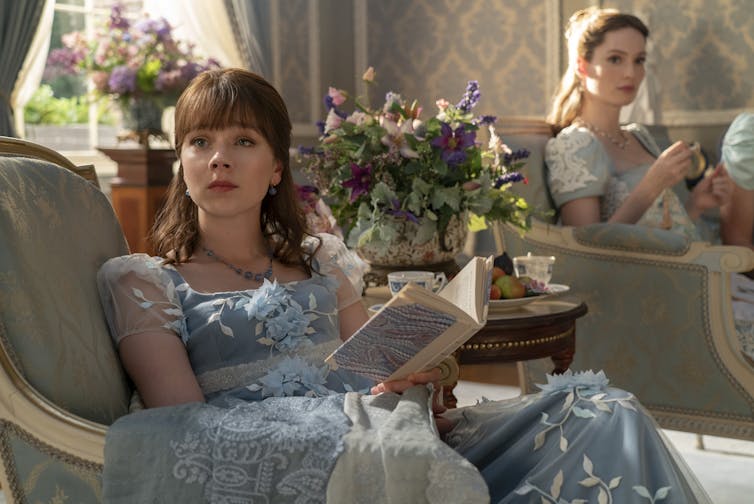
Eloise Bridgerton is an outspoken character who challenges the ‘norms’ that seek to limit the women around her. Netflix

Two decades ago, romance plots tended to feature a protagonist with a fabulous big-city job (often in publishing), but their occupation would come second to the goal of finding “the one”. How to Lose a Guy in 10 Days, Never Been Kissed and 13 going on 30 are just some examples.

Meanwhile, in Shondaland, a romance masterplot can be superseded by the trials and tribulations of a woman’s career and her journey of self-fulfilment. The joy of escapism now twists into watching women excel in their own right alongside the expectation of the happy ending, or at least the “right” ending.

It’s no wonder we’re still hanging around for Rhimes’ stories in 2024.The Conversation

Rebecca Trelease, Senior Lecturer in Communication Studies, Auckland University of Technology

Subscribe to support our independent and original journalism, photography, artwork and film.

Monday 13 May 2024

Photos are Everywhere. What Makes a Good One?

T.J Thompson


By T. J Thompson, RMIT University

We upload some 3 billion images online each day. We make most of these photos on smartphones and use these devices to document everything from gym progress and our loved ones to a memorable meal.

But what makes a “quality” photo? Many people, even those who make images for work, struggle to answer. They often say something along the lines of “I know it when I see it”. But knowing some dimensions of a quality photograph can help make your images stand out and make you a more literate media maker and consumer.

Quality can be relative, but knowing the various dimensions at play can help you draw on those that are most relevant for your particular audience, context and purpose.

I identified six dimensions which will impact the quality of photographs. Here’s what I learnt – and what you can apply to your own photographs.

1. Production and presentation

Think of the factors in front of and behind the lens.

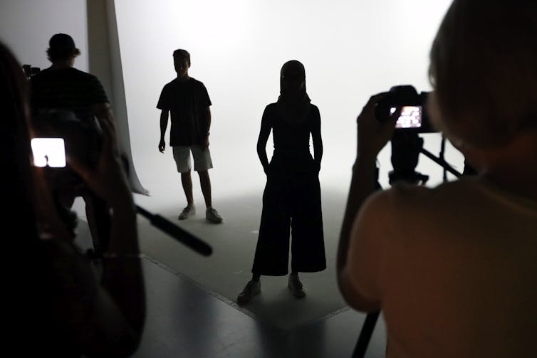
If you know you’re being recorded, this can affect your behaviour compared to a candid depiction.

You might be more or less comfortable posing for a friend or family member than for a stranger. This comfort, or its lack, can lead to more stiff and awkward poses, or ones that look more natural and confident.

Silhouettes of people in front of a camera.
Awareness of being observed can impact the final photograph. T.J. Thomson

Presentation circumstances, like the viewing size and context, also matter.

A group shot can make a nice statement piece above a fireplace, but it wouldn’t have the same effect as a profile photo. Be aware of how “busy” your image is, and whether the viewing conditions are well-suited for the nature of your photo.

Images with lots of elements, fine textures or other details need to be viewed large to be fully appreciated. Images with fewer, larger and simpler elements can usually be appreciated at smaller sizes.

2. Technical aspects

Technical aspects include proper exposure – meaning the image isn’t too dark or too bright – adequate focus, and appropriate camera settings.

Some of these camera settings, like shutter speed, affect whether motion is seen as frozen or blurred.

People walking up stairs.
A slow shutter speed can introduce motion blur and enliven an otherwise more static composition. T.J. Thomson

If the image is too blurry, too pixelated, or too light or dark, these technical aspects will negatively impact the photograph’s quality. But some motion blur, as distinct from camera shake, can make more dynamic an otherwise static composition.

3. Who or what is shown

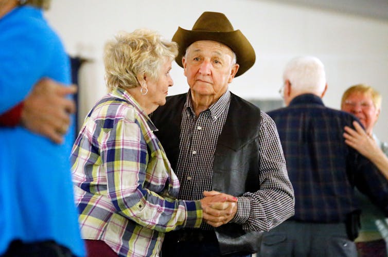
An older couple dances.
Older people tend to be under-represented in public photography, T.J. Thomson

Who or what is shown in the photographs we see is affected, in part, by access and novelty. That’s why we often make more photos during our holidays compared to documenting familiar settings.

Some people or locations can be under-represented and photographing them can lead to more visibility, and, depending on the context, a more empowering framing.

Consider in your photography if you’re including people who are typically under-represented, such as older individuals, people of colour, people living with disabilities and queer people. Also consider whether you’re representing them in stereotypical or disempowering ways.

As examples, when photographing older people, consider whether you’re showing them as lonely, isolated, passive, or in need of mobility aids.

4. Composition

A man in the gym.
Use items in the built or natural environment as framing devices. T.J. Thomson

Composition includes positioning of elements in the frame, the balance between positive and negative space, and depth, among others.

Generally, images that centre the subject of interest aren’t as visually engaging as images that offset the subject of interest. This is what’s known as the rule-of-thirds approach.

Likewise, images that have no depth are generally not as interesting as images with a clear foreground, midground and background. “Seeing through things” with your compositions can help increase the visual depth of your photos alongside their visual appeal.

5. The psycho-physiological

The psycho-physiological concerns how the viewer reacts to what is shown.

Men stand near a red car.
Images can spark an emotional reaction. T.J. Thomson

This includes the biological reaction we have to seeing certain colours, for example the way the colour red can increase our heart rate. It also can include the feeling we have when seeing a photo of someone we know.

The most powerful photos use colour and other elements of visual language strategically for a specific effect. Looking at these images might evoke a specific emotion, such as empathy or fear, and influence how the viewer responds.

6. Narrative

Narrative concerns the storytelling quality of the image.

Images can show something in a literal way (think a photograph from a real estate listing) or they can tell a bigger story about the content represented or about the human condition (think about some of the iconic photos that emerged during Australia’s black summer bushfire season).

Literal photos help us see what something or someone looks like but they might not have as much of an impact as iconic photos. For example, the well-known photo of three-year-old Syrian boy Aylan Kurdi’s lifeless body on a beach in Turkey boosted fundraising for refugees 100-fold.

A more thoughtful process

Next time you pull out your smartphone to make an image, don’t just “spray and pray”. Try to pre-visualise the story you want to tell and wait for the elements to line up into place.

Being aware of aesthetic and ethical considerations alongisde technical ones and emotional resonance can all help engage viewers and lead to more standout imagery.

To challenge yourself further, consider taking your phone off full-auto mode and play with camera settings to see how they impact the resulting photos. The Conversation

T.J. Thomson, Senior Lecturer in Visual Communication & Digital Media, RMIT University

This article is republished from The Conversation under a Creative Commons license. 

Subscribe to support our independent and original journalism, photography, artwork and film.

Monday 6 May 2024

Newly Uncovered Helen of Troy Fresco Shows Pompeii’s Elite Were Eager for Ancient Greek Stories about Women


By Emily Hauser, University of Exeter

Imagine seeing the face of Helen of Troy staring back at you, from within the ashes of a 2,000-year-old city. But these aren’t the burned walls of Troy. And these ashes aren’t the scars of a city burned down for the sake of “the face that launch’d a thousand ships”. This is Pompeii.

Helen is depicted in stunning detail (alongside Paris, the prince of Troy) in one of the paintings on the recently discovered fresco wall of the winter dining room of a Pompeian villa. Other paintings on the walls depict two more women from the Trojan war myth – Helen’s mother Leda and Cassandra the Trojan prophet.

When this ancient Roman town was blasted by the fatal eruption of Mount Vesuvius in AD79, it must have felt much like the all-out siege that the ancient epics, by poets like Homer, tell us battered Helen’s Troy. But this siege was brought about by the violent forces of nature, not war.

As ash poured down on Pompeii and super-heated explosions charged the streets, the victims of Vesuvius fell where they stood, captured in the pumice that pummelled them and their homes like sling-stones. People ran, leaving bread in ovens that would never get eaten and paint pots abandoned alongside half-decorated walls.

As the Roman lawyer and author Pliny the Younger writes in his eyewitness account of the disaster, in that night where “the darkness was darker and thicker” than any other, it was as if the whole world was ending.

Parts of the town that haven’t seen the light since that last darkness closed over the Pompeian sky are now being uncovered again. In a rescue mission to preempt potential collapse, parts of what’s known as region nine of Pompeii are being excavated for the first time.

Ash is getting scraped back, walls are rearing up into the sunlight out of the piles of rubble. And as the archaeologists dig, more of Pompeii’s secrets emerge, in astonishing condition, bright as the day they were buried.

The women of Troy

The painting of Helen is the latest in a series of remarkable discoveries, that also brought us the fresco of something that looks astonishingly like pizza.

Every clue that comes out of the rubble in Pompeii provides valuable information to ancient historians like me about the lost world Pompeii represents. They tell us about the way people lived, from the gorgeous frescoes all the way to the sewage trapped in the drainpipes (I spent a summer studying this and it is more fascinating than it sounds). But there is something particularly special about these mythical paintings.

It’s not just their unusual style, which shows the painters experimenting with new techniques and representing the latest artistic fashions. It’s the trio of women from Greek myth collected together in a way that makes us see the Trojan war myth anew – and puts the stories of women at the forefront.

And it’s an amazingly fitting time for this discovery. Over the past decade, a tidal wave of bestselling novels has hit the mainstream retelling the stories of the women of the Trojan war – from my own, For the Most Beautiful (2016) to The Silence of the Girls by Pat Barker (2018), A Thousand Ships by Natalie Haynes (2019) and Clytemnestra by Costanza Casati (2023).

This moody, dark-walled dining room in a private villa was likely the residence of the Pompeian politician, Aulus Rustius Verus. It shows that, just like us, Pompeii’s elite were well versed in – and eager for – stories of the women of ancient Greek myth.

The role of the fresco

Triclinia (three couches set around a table, where guests would recline), set up in front of frescoes such as this, were the perfect place for Pompeians to gain new perspectives on old stories.

Every couch gave you a different point of view on the myth. Sit on one side, and you’d be faced with the image of Helen’s very first encounter with Paris. Is Paris’ outstretched arm an invitation or a threat? Is there a sense that Helen is lingering, uncertain, with that back foot scraping behind her?

Homer’s epics – the first to tell Helen’s story – are ambivalent about whether Helen was raped by Paris or went to Troy of her own accord. This painter seems to be exploiting that ambivalence.

You can just imagine the Pompeian literati quaffing glasses of expensive wine as they gazed at Helen’s face and debated the subject.

But this isn’t the only chapter in the tale. Sit elsewhere, and you’d have a stark reminder of a very different angle on the myth: the disturbing background to Helen’s birth, and the context to so many stories of women in the Greek myths. Just behind Helen is painted a graphic image of Leda, Helen’s mother, being attacked and raped by Zeus, in the form of a swan.

And then, last but not least: on the opposite wall is a depiction of Cassandra, the prophet of Troy. She was cursed by Apollo to tell the truth and never to be believed after she refused to have sex with him. No matter how many times she screams that Troy will fall, nobody listens. This is the price of ownership over your body as a woman in Greek myth – the loss of your voice.

From a rape to an abduction, to a curse. These three women’s stories offer an overture of the Trojan myth. The start, with the birth of Helen, the cause, with Helen’s leaving for Troy and the end, with Cassandra’s predictions of Troy’s fall. United around this Pompeian dining room, they are a spectacle, a conversation starter – a fabulous (and fabulously well connected) tale.

But they’re also a warning. Troy fell. And so will Pompeii. As the grim skeletons discovered in the villa show, just like the Trojans, Verus and his guests didn’t listen to Cassandra either.


Emily Hauser, Senior Lecturer in Classics, University of Exeter

Subscribe to support our independent and original journalism, photography, artwork and film.