
 |
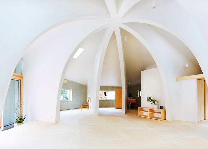
| Eight ribs radiate from the centre of the ceiling to the floor and divide the room into areas that create spaces for dining, studying and sleeping around the perimeter of the house. |
Ambrosio De Lauro reports on a new house in Tokyo's Tochigi Prefecture by architect Hiroyuki Shinozaki. Photographs by Fumihiko Ikemoto
DESIGNED by the young Japanese architect last year, this small house is given a soaring sense of space by its ribbed roof construction which forms a great dome over the living space. The groined arches are deep enough to create a division between the open plan spaces of the house.
While the exterior is rather unprepossessing and looks like an American 1950s bungalow, the interior is unusually dramatic for a compact space. The architect used a local volcanic stone for the building's outer walls which came from a quarry near the house and supports the great roof above. The house is located in a region of mixed use with both fields and houses. The site is at the end of a blind alley but has glimpse of gardens and green meadows and neighbors can greet each other over the low stone fences that divide the houses.
Home to a family of three in Japan’s Tochigi Prefecture in Tokyo, the house is 92 square metres in floor area. "Enveloped by its surroundings, the design enhances the sense of space and makes it feel bigger while the slope of the big roof accentuates the sense of perspective,'' says Shinozaki.
The interior has the central living room at its heart with the ribbed timber vaulting curving above this open plan space. Eight
ribs radiate from the centre of the ceiling to the floor and divide the room
into areas that create spaces for dining, studying and sleeping around the
perimeter of the house. There is also an entrance lobby and a small terrace at the
rear of the building. Wooden ladders lead up to small lofts while various skylights and large, glass doors bring light through the house.
Shinozaki was born in 1978 also in Tochigi Prefecture and graduated from Kyoto Institute of Technology. Later he completed a Masters degree at Tokyo National University of Fine Arts and Music. He worked for Toyo Ito Associates before establishing his own practice in 2009.
Called House I, this is the latest in a series of residences
by Shinozaki named after alphabet letters. He has also designed House
H and the award-winning House T.
Click on photographs for full-screen slideshow
 |
| The entrance to House I leads into a dramatic, vaulted central living space with a minimal kitchen located between two of the soaring ribs. |
 |
| The design enhances the sense of space and makes it feel bigger while the slope of the big roof accentuates the sense of perspective,'' says the architect |
 |
| Large, glass doors, plenty of windows plus skylights allow the interior to be flooded with natural light. |
 |
| Eight ribs radiate from the centre of the ceiling to the floor and divide the room into areas that create spaces for dining, studying and sleeping around the perimeter of the house. |
 |
| While the exterior of the house is rather unprepossessing and looks like an American 1950s bungalow, the interior is unusually operatic for a compact space. |


